Plotting in python
03 Feb 2019Using Matplotlib and Seaborn library’s
Matplotlib tries to make easy things easy and hard things possible. You can generate plots, histograms, power spectra, bar charts, errorcharts, scatterplots, etc.It is useful in producing publication quality figures in interactive environment across platforms.To know more about this library, check this link.
Seaborn is a Python data visualization library based on matplotlib. It provides a high-level interface for drawing attractive and informative statistical graphics.o know more about this library, check this link.
Before Plotting you need to import dataset first.
Various Types of Plots
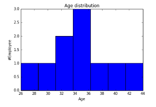
1. Histogram: The hist() function automatically generates histograms and returns the bin counts or probabilities.

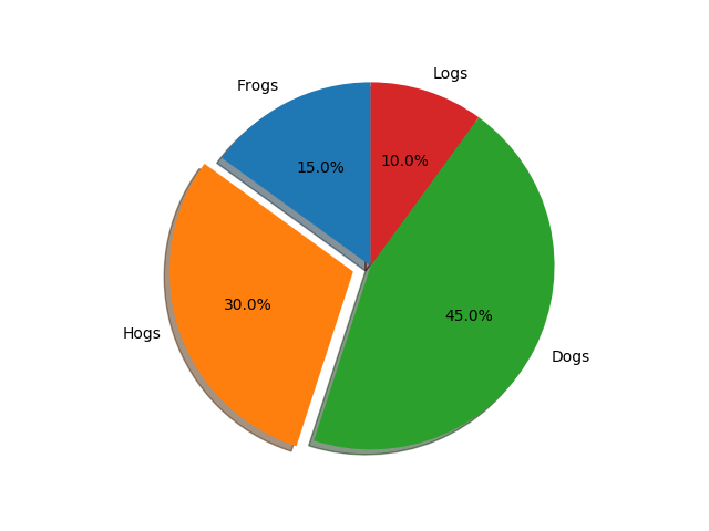
2. Pie charts: the pie() function allows you to create pie charts. Optional features include auto-labeling the percentage of area, exploding one or more wedges from the center of the pie, and a shadow effect.

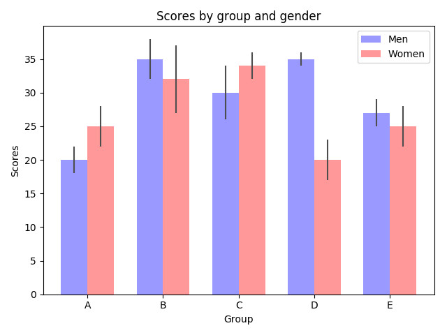
3. Bar charts: Use the bar() function to make bar charts, which includes customizations such as error bars.

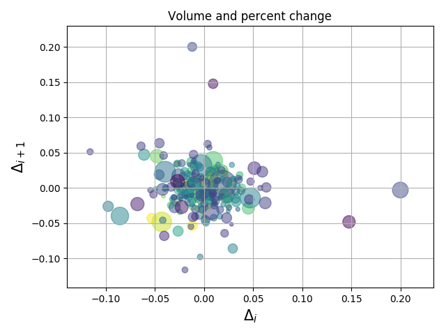
4. Scatter plots: the scatter() function makes a scatter plot with (optional) size and color arguments. This example plots changes in Google’s stock price, with marker sizes reflecting the trading volume and colors varying with time. Here, the alpha attribute is used to make semitransparent circle markers.

More Sources to find various plots.
matplotlib , analyticsvidhya ,data-visualization
Thanks for reading it.
***